The brief for the production was to create a music video for an unsigned British band, before making a digipack for the single and a poster to advertise the new release. This meant I had to use and develop on my skills of using real media products that I used for my previous thriller production to create an interesting and convincing production. One of the media products I used were my skills were developed was the use of a video camera. The representation of the mise-en-scene was much different to the way it was used in a thriller, with the genres contrasting each other and the appeal of the target audience being different. In the thriller production noir lighting was used, while in the music video the lighting used was bright symbolizing the fast and happy beat to the song. This is shown in the shot of the male character playing the guitar with the sun shining down onto him, to establish his talent and anticipating his iconic states. The bright lighting used with the fast beat relates to the music video for ‘A-Punk’ by Vampire Weekend, meaning one of Goodwin’s theories is used - intertexual reference.
A music video is very different to a film production, shown in the camera shots that are used. My music video doesn’t follow a strict narrative structure, which means the camera angles are used to market the artist rather than suggest menace and suspense. I used close ups of a guitar being played throughout the production to symbolize the indie pop genre, with guitars one of the main instruments and iconic aspect of the genre. This is used at the beginning of the music video with a close up of fingers strumming a guitar. The use of close ups also helped to define the costume of the characters in the music video, for example a close up shot of the female character’s shoes. These shoes didn’t really fit in with the indie pop genre though as I filmed a few shots spontaneously and thus the shoes challenge aspects of the indie pop conventional costume. An example of this would be the walking scenes based halfway through the music video.
Throughout the whole of my filming I used a Canon, a make that is renowned for shooting quality home made films for many in the early 21st Century, and this quality is a conventional generic trait. A music video that portrays such a technique is ‘Your Song’ by Ellie Goulding, who shot a music video with the same vintage look, which used a majority of shots focused on the female.
The main music video that inspired me was ‘Your Song’ by Ellie Goulding. I was using a blonde actress and a performance based montage style narrative structure. I decided that I would try to install the same idea of the use of a clip show of shots. ‘Your Song’ is based around the idea of love, a theme of indie artists such as Ellie Goulding, Florence and the Machine, and The Kooks. The chorus of my chosen song used the lyrics “You don’t know. You don’t think”, which suggests a romantic relationship. ’Your Song’ uses shots that are edited to look like a home video, making the music video look like a series of vivid memories captured by a person about their loves. I adapted this into my own music video, yet challenged the conventional ending for a love story. The male and female characters are only seen together in shot twice, one of these times showed them being separated by a tree when I shot the tree collapsing to indicate their hopes are falling apart. At the end of the music video the male and female look as if they are running towards each other before they both fade away before reaching each other, implying the fading idea of an impossible dream.
Throughout the music video there is a strong use of post-modernist gender theory, with both the characters being represented as equal through the use of close ups. An example of this would be the close up of the female up during the snow scene and the close up of the male character playing the guitar. However the female isn’t represented to play the guitar, suggesting that females are still marginalized as artists in the music industry.


The use of a guitar was quite important for my music video, with the involvement a generic convention. The indie genre, for example, uses performance based shots in most music videos to help establish the artists’ performance credentials. These artists include Vampire Weekend, Scouting for Girls, and The Wombats.
Whereas, compared to pop music videos, this isn’t shown as much as the artists do not establish their career on live performance. I have used shots where the male character is playing the guitar casually, to create a connection between both artist and audience.

When researching media productions for my print productions, I discovered that many bands used shots of guitars in their digipacks. For example artists like Jack Johnson, Taylor Swift and The Kooks.

I decided to challenge this convention as I found it a dreary image which doesn’t market the artist as unique or distinctive.
For the front cover I decided to take inspiration from Ellie Goulding’s album again, adapting the way that the images on the front cover of her singles are used.

I had researched into the idea of showing both characters, male and female, on the front cover taking ideas from ‘Velvet Mustache’ by White Apple Tree; or using the idea of just the male character from the front cover of Cardiography by David Vertesi.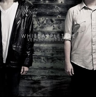

Yet from the images that I captured, the most suitable image that could be used on the front cover of the digipack was of the female character. The image shows the female standing in front an edited white background suggesting that she feels lonely and vulnerable, yet also suggesting she stands out like an angel. With the use of Photoshop the image was adapted into something more appealing to the audience, and the name of the artist and song title was added in black font to help stand out from the white background.

The inside panels of a digipack are images that intrigue the audience, yet their main purpose of being there is to make the CD stand out and for decoration. I used my own creativity and inspiration to design both images, taking them from my music video and using Photoshop to edit the pair. The left panel (second out of the four) will be the image that the audience will see more, with the other panel having the CD cover it. The names of the band members were installed onto this image, giving them more familiarity with their audience. The text is in white font, helping to make it stand out and grab the attention of the audience’s eye. The colour of the background is dark clashing with the white of the snow to add a scene of drama. The use of black in the image with the ghost like editing of the characters symbolizes the temporary nature at young love.

The right panel of the inside of the digipack (the third panel out of the four) is the panel where the CD will be situated. This image is of the male character playing the guitar while the sun shines down onto him. The image is super imposed with the eyes of the female character, suggesting that she is his muse. This panel contrasts to the mood of the left panel, with bright colours used instead of the dark colours in the other panel to add contrast.

The back cover of a digipack is where most of the institutional details are held, including song titles, the record label, and the band’s website. The image that I used for the back cover was of both characters leaning up against opposite sides of a tree.

I used Photoshop to change the colours of the image, making the left side of the image (the side of the female character) black and white, while increasing the contrast and brightness of the right side of the image (the side of the male character). This idea was used to highlight the contrast between the male and female characters. I input the informative text in the middle of the image, situated on the tree, as the image follows the rule of thirds so the audience’s eye is attracted to the information about the album.

With the text on the back cover important to inform the audience I researched different fonts to find out each one appealed to the audience the most. Using the website ‘dafont.com’ to look at different types of font I was able to narrow it down to a shortlist of two. The two fonts were; Hand of Sean and Verdana. After trying both and seeing which best fit the image, I chose Hand of Sean.

In the 21st century the way that new albums and artist are marketed have completely changed and developed thanks to technology, thus making the research for my advertisement poster difficult. Only a few artists use magazine adverts nowadays, so I decided use ideas from all genres. I was inspired on how to design my poster from the help of two posters; one advertising Italian heavy metal band Arthemis, and the other being the English RnB group N-Dubz.


I took the designs that both had used and developed them together. I used the inclusion of the front cover of the digipack on the poster from Arthemis, along with the use of persuasive text, such as “the world’s greatest songwriters”, to help the sell the album. I then merged this with the use of an image as a background instead of just a plain colour, inspired from the N-Dubz poster, challenging the convention for most unsigned indie bands that use a white background or an image of the band members themselves.
 With the help of Photoshop, I decided to use an image of the feet of both characters from the music video with a picture of the front cover of the digipack in between their legs, using the rule of thirds again to make the audience attracted to look at the album.

The input of positive text of the album was essential for the poster to help encourage the audience to buy it; this being used at the bottom of the poster underneath the character’s feet. Website information is included so potential fans can find out more about relend.

I also had to research the font that I used for the name of the artist and album, using the same website as before ‘dafont.com’. After looking through the fonts that I believed would suit the genre, I decided to use the ‘Green Pillow’ font, with it having a conventional indie pop look.


After the completion of the music video I then had the task of creating the print productions for the release of the artist’s album, which includes the music track that the music video is based on. The use of continuity of the print productions from the music video was needed; with familiarity used to help keep a clear link between both productions, a link that would be based on the genre of the artist. The one clear link between the two productions is the use of the images for the digipack and the advertisement poster.
Digipack
The clearest link between the music video and the digipack are the images that are used. The images that have been used for all the panels of the digipack are from the music video, thus creating a familiar link with the audience noticing the images. This means the audience know who the artist is when they see the digipack from the memory of the image being in the music video reminding them of the music that goes with it. This link would help with the distribution of the album.The theme of love is also included in the digipack productions, developing on from the music video. An example of this would be panel 4 of the digipack.

Even though this image is included in the music video, it is edited and develops a new meaning. The image shows the difference of the two genders, being shown through the adaptation of the colours that are used. The change effectively helps to keep the image fresh having already been used before, creating a positive feeling of the audience and making it the iconic image that is remembered by the audience.
Magazine Advert

The magazine advertisement, like the digipak, uses images from the music video to create a link between the two productions. This is done so while the target audience are flicking through a magazine, like NME or Q Magazine, their attention is quickly alerted towards the poster as it is an familiar image after they saw the music video. The advertisement would be in NME or Q Magazine as these are favourites of the target audience as talk about the genre of music that We Can't Dance finds themselves in, indie pop. These magazines also help to promote smaller bands to a wider audience who are interest into similar artists.
Question 3: What have you learned from your audience feedback?
The feedback method that was used for the audience research was the same for both productions, with a hard copy questionnaires being utilised. The demographic audience that was researched were 16/17 year old media students; this meant that some of the demographic were not of the target audience meaning the music video and print productions would not appeal to them. However, the positive side of this would be that they understand the editing and camera techniques that were installed into the production. Separate questionnaires were made for each production, yet the feedback techniques were similar. The first six questions were multi-choice, with the first five being a choice of score from 1-5, 1 being the worst while 5 was the best.The first two questions for the print production questionnaire focussed on the genre of the music and whether it was successfully reflected in the digipak and magazine advert. The average score that was generated for the first question 3 out of 5, with 4 being the highest and 2 being the lowest. While the average score for the second question was 3.5, with the highest score being 4 and the lowest being 3. For both questions the male members of the audience voted higher than the females, showing that males found the genre reflected more than the females. This was shown with one female member of the audience writing down that she struggled to understand the genre of the print productions. The next two questions, three and four, focussed on the standard of graphics used in the print productions with an average score of 3 for both questions. The colours that were used in the magazine advert were highlighted as the strongest feature of the print productions, standing out to attract the attention of the audience. This was a common opinion from both males and females, although males still voted higher in this section. The fifth question solely focussed on the Britishness of the package, collecting a poor score from both genders. The average score was 2, suggesting that the audience did not feel that the prints had a successful British feel. This would be the area that would need to be improved next time the task was taken. The sixth question asked the audience if the advertisement would encourage them to buy the digipak, with the common outcome if the audience being undecided. This meant the advert would have to be improved for the next album, potentially having an increase the persuasive language that was used on the poster.
The overall views of the print productions were good, getting an average score of 3 out of 5. The audience were not offended by the images meaning that a mainstream high street shop, like HMV, would accept to having the digipack in their shops. The demographic that favoured the print productions were the males who had an average of 4 out of 5 compared to the 2 out of the 5 by females. This could be affected by the use of the male gaze that is highlighted best on the first panel with the representation of the female character and the camera angle that is used.
 This would have to be changed for the development of the next front cover that is made, with the sales from females being affected by this.
The first two questions for the music video questionnaire focussed on the feelings of the audience, how much they enjoyed it and whether their attention was held by what they were watching. The average score for the first question was 3.5 meaning the audience fairly enjoyed the music video. The highest votes, 4 out of 5’s, were made by females showing that they enjoyed the music video more than males did. The average score for the second question was 3.5 with a wide range of votes, the highest being a positive 5 and the lowest being a disappointing 2. The voting was again for positive from female audience members, with 4s and 5s contrasting from the 3s and 2 from males. With the music video being inspired by Ellie Goulding, who has a higher female audience than male, this reflected on the scores in my own production. Learning from this, the next music video that would be made would have to have connotations of more a balanced audience from the researched artists. The next two questions, three and four, focussed on the technique side of the music video asking the demographic audience about the mise-en-scene, the camera work and the editing. The average score for question three being a strong 4, with four members of the audience out of six voting 4 out of 5 along with a single vote going to 5 out of 5 and 3 out of 5. These results showing a positive feedback to the camera work and editing of the music video with two demographic members labelling the editing as the strongest point of the production, however one member suggested that improved editing would help to increase the appeal. This shows the different views that people have, highlighting the difficult task of keeping everyone happy with the music video that is made. The average score for question 4 was 3.5, the highest vote being 4 with half the audience voting this way. The lowest score was 2 out of 5, contrasting with the nature of the votes and lowering the average score. The fifth question asked the audience their opinion on the length of the video, with the majority voting that the music video was too short. This highlighted the need for the possibility of having a back up narrative structure in case the first choice doesn’t work like during my production. The sixth question asked whether the audience would listen to the music track again, with 50% saying that they would. This showed that half of the demographic audience that evaluated the music video were not members of the target audience, making it difficult to find the opinions of the audience that the music video was aimed at. However having a mainstream audience evaluate the music video, this helps to suggest ways that a wider audience would be appealed to the production in the future.
The overall view of the music video was positive with an average score of 3.5, yet lots of positive feedback written on the questionnaires with the strong points of the production. These included the editing, the stop motion, the running motion scenes, the location of the music video and the use of natural light.

The music video also did not cause any offence to any of the audience members, meaning the music video would be accepted by the mainstream. On a negative however, one member was confused by the ending of the music video with the characters running towards each other in the snow.
This person was not a member of the target audience however so would not understand the genre conventions of the music video. The different genders both voted similarly showing that the music video appeals to both males and females. Yet the 16 year olds in the audience voted higher than the 17 year olds overall, suggesting that the age of the audience members that are appealed to the music video are young teens rather than the older teens who would discuss music more with their friends.
Question 4: How did you use media technologies in the construction and research, planning and evaluation stages?
During all sections of the production, the use of media technologies was an important aspect to help aid the production to completion. In the 21st century technology is a major part of life in the media business with the use of computer software to complete tasks like a music video or thriller film. Technology is used from research of the bands on the internet, to the construction of the music video itself.About ten years ago the research and planning section of any media production would consist of work being written or drawn on paper, and with the amount of planning that is involved, keeping organised and the mobility of the work would be a difficult task. Nowadays, these sections are performed with the use of computers and the internet. The paperwork, that was once stored manually in a folder, is now written up and saved on a computer before being uploaded onto an internet blogging website called ‘Blogger.com’.

For drawings, like design ideas for print productions, they are manually drawn on paper before being installed onto a computer with the use of a scanner. This was done for the storyboards for the music video, along with the design ideas for the print productions.

For researching similar media productions ten years ago the only way of this would have been possible was watching music channels, like MTV, although there was only a few at this time. Another problem with this method was there was no control over the music videos that came on; meaning the music videos that came on might not have been of the same genre that was needed to be researched. Luckily, with the improvement in technology during my research stage I was able to use websites like ‘YouTube’ and ‘MySpace’ to watch music videos of the same genre and gather important aspects to the representation of the genre. These websites also helped me to find my chosen artist.

The use of ‘Blogger.com’ was not only helpful during the beginning stages of the production, but throughout the duration of the course when work was uploaded to the blog tutors were able to make comments. These comments were there to help advise improvements and help to evaluate creative ideas that I had. An example of this would be where I made improvements on audience research, creating a better examination of the genre’s audience.

When researching for design ideas for the print productions I looked at the digipack images of the artists whose music videos I researched, using websites such as ‘Play.com’ and ‘iTunes’.

This gave me immediate access to the current and previous digipacks that have been released by a certain artist, furthermore including the views of the target audience. I also went onto the NME website, looking at the album covers that they nominated the best of year. With the indie pop genre being a main genre NME look at the five albums that were nominated showed me the modern album front cover in this particular genre. I then tried to look at album covers of other genres to get more ideas to help the challenge the genre conventions of indie pop images. These different genres included RnB, Heavy Metal and Folk.


The album covers that inspired me the most were then researched in more detail, learning the meanings behind the images to create links between them and my own production. With the help of ‘Blogger.com’ I was able to keep the inspirational images with added notes in a safe place, where they could also aid me during the design stage.
The need to the keep the audience’s opinions in mind during the creation for both of the video production and the print production was a necessary. Both productions have to be made to appeal to the target audience, with their interest a priority for the success of the productions. The research of the audience is done throughout the development of the production; for example I made four different designs for the front cover of the digipack so asked members of the target audience which design they preferred and appealed to them the most by using a voting system.

The voting system was not only used in the old fashioned way of paper ballots, but also on social network sites like ‘Facebook’ and an personal blogging site ‘Tumblr’. With myself constantly checking which designs were the best with every part of the production, I kept a close understanding with the target audience to assist in the creation of a successful production.
During the planning stages having gathered the research into the genre conventions of the indie pop genre, I had to use these to help create a narrative idea. With the different aspects of the genre researched this gave me a number of potential ideas that I could use for the music production. To develop these ideas, I used a stills camera to shoot potential shots that would be included in the music video. These stills shots helped to show which narrative idea looked best. The shots were uploaded onto ‘Blogger.com’, with my tutor giving their own opinion on improvements and suitable with the genre. An example of this would be during the planning for the location for the music video, with stills images taken of different places around Norwich where the target audience are most commonly found, setting an ideology of the band to the audience.

Even though the chosen narrative structure looks like a potential successful production in thought, during the shoot the footage that are collected may not fit into how the music video in the original narrative structure. Thankfully with the technology of video cameras introducing the ability to watch raw footage that was taken on the camera itself, the creativity of different camera angles and shots increased; ten years ago the possibility of the revision of raw footage would not happen till the editing stage of the production. The improvement in video cameras means that there is a screen showing the footage that has been taken, along with showing the shots that are being taken when recording the scenes. If footage that was taken was not of a acceptable quality then it could be recorded over, however having a high number of different shots is a good thing to have during editing as it may be needed further on in the production. As I was able to review the footage that was gathered whilst on the shoot of the music video I was able to spot the disadvantages in the production. This resulted in the entire narrative structure of the music video being changed; without the hassle of having to re-organise a new date for the new shoot, helping with a strict seclude. With the video cameras being digital now it also simplifies the task of recording footage, with video cameras previously recording onto a tape. Digital cameras can be connected to a computer via USB cables, meaning the video footage can be uploaded to the computer.
For the editing section of the production the computer software ‘Abode Premiere Elements’ was used to help place the footage together along with adding the chosen song to accompany the shots, to complete the music video. The editing stage of the music video is a very complex and time consuming part of the production, with not every shot working in its planned position. By using the computer program I was able to piece together the footage before installing special effects to the music video, giving the music video a more professional and finished look. The music video uses special effects consisting of cross fades, fade to blacks; while also placing two shots on top of each other to create a ‘ghostly’ effect, this being used at the end of the music video while the two characters run towards each other.
Cross fades are used to connect the contrasting footage together, like the change of location, cleanly helping to guide the audience through the music video. This was used to most effect when the male character is playing the guitar and the shot changes to the eyes of the female character; the eyes are seen to be looking over the male character connotating the genre convention of love.

The fade to black effect was used on one occasion, when the camera falls over to symbolize their relationship of ending or heading into darkness, this was used rather than a cross fade as other footage would appear in the wrong order. Without the use of ‘Abode Premiere Elements’ or any other computer software program the editing of the music video would have been very basic, while also causing a challenge. The use of computers is accentual during the editing of any production in the 21st century.
Print productions are an important aspect of the distribution of any music track, especially with unknown artists who use their print productions to attract the attention of the audience. With the print productions using only images, compared to the music video using images and video footage, the contrast of the image and the camera angles were important to signify the meaning behind the shot. For example, the image used on panel 4 shows the difference between men and women with the difference in colours used.

With suitable images already being taken with the video camera during the shoot, while also taken images using a stills camera when taking images for how the footage was shot. These images were uploaded onto a computer, before all shots were reviewed by selected members of the target audience on the social networking site ‘Facebook’ and ‘Blogger.com’. The audience gave their views on the images, including weaknesses along with strengths, helping to create new ideas of how the images could be used to the greatest appeal. This helped with the choice of font, colour and positioning of the text on the front cover (panel 1).
 The computer software programme ‘Photoshop’ was used to edit the images, as well as to input the informative text about the band and the album. Without the use of computer technology the feedback from the audience that helped aid the creativity of the print productions would have been carried out by the use of paper, meaning the amount of people evaluating the images would not have been as high.
With the use of social networks like ‘Facebook’ and ‘MySpace’ growing in numbers the way artists market their productions is done mainly on the internet. The music video is uploaded onto ‘Facebook’ and ‘YouTube’, where I managed to gain feedback from the audience. These websites are useful for the artists of the indie pop genre, with the target audience using the social network websites fairly often. This means that they would find the music video and possible want to develop their interest further by going onto the artist’s website, which is included in the description of the video. Feedback from the audience helps signify the strengths and weaknesses of the production, informing me where improvements can be made. This helps to create a music video that appeals to the audience for the duration rather than just a section of the music video. An example of artists who us this approach include Young Guns and Ed Sheeran, who both use their social network accounts to promote their music and ask for audience feedback.

With artists acknowledging their fans by taking and using their opinions this creates a friendly and positive feeling towards the artist, helping to spread the word of their music and gain more fans.
In order to successfully write the evaluation of the music video production the use of technology was key. The evaluation was written out on ‘Microsoft Word Processor’, a much reliable computer program to use to make sure the file is safe and gives better aid to having correct spelling and grammar. When finished the evaluation is copied and pasted onto ‘Blogger.com’, which enables examples of points made to be backed up by images and screen shots. These images, when installed, can also be used to compare to each other. The images were saved on ‘Photoshop’ as JPEG files, making the images easier to upload onto ’Blogger.com’. Throughout the development of the evaluation 'Blogger.com' was constantly checked to review my production to create a detailed evaluation with examples, while also e-mails were sent between myself and my tutor. The e-mails consisted of adaptations to the evaluation, helping to fulfil the requuirements of OCR.