
 These are the potential designs that I drew out for the print productions. The top image shows the inside panels of the digipack, while the other image shows the the front and back panels of the the digipack.
These are the potential designs that I drew out for the print productions. The top image shows the inside panels of the digipack, while the other image shows the the front and back panels of the the digipack.
These are the potential designs that I drew out for the print productions. The top image shows the inside panels of the digipack, while the other image shows the the front and back panels of the the digipack.
 Different methods on how to use stop motion were thought of, with design models being made to test the effectiveness of each method. Method one was to used one word per an A4-sized piece of paper, with the text being printed off the computer after the use of a word processor. The shot would then only show a change in word and not the background scenery of the mise en scene. Method two was to use post it notes with the text being handwritten. The post it notes would be stuck to a white paper background in different shots, with only one note in the first and two in the second etc. Method three was to stick together post it notes to create the words of the chorus. The letters would spell out the words, and be filmed on a paper background being similiar to the other methods.
A music video is very different to a film production, shown in the camera shots that are used. My music video doesn’t follow a strict narrative structure, which means the camera angles are used to market the artist rather than suggest menace and suspense. I used close ups of a guitar being played throughout the production to symbolize the indie pop genre, with guitars one of the main instruments and iconic aspect of the genre. This is used at the beginning of the music video with a close up of fingers strumming a guitar. The use of close ups also helped to define the costume of the characters in the music video, for example a close up shot of the female character’s shoes. These shoes didn’t really fit in with the indie pop genre though as I filmed a few shots spontaneously and thus the shoes challenge aspects of the indie pop conventional costume. An example of this would be the walking scenes based halfway through the music video.
Throughout the whole of my filming I used a Canon, a make that is renowned for shooting quality home made films for many in the early 21st Century, and this quality is a conventional generic trait. A music video that portrays such a technique is ‘Your Song’ by Ellie Goulding, who shot a music video with the same vintage look, which used a majority of shots focused on the female.
The main music video that inspired me was ‘Your Song’ by Ellie Goulding. I was using a blonde actress and a performance based montage style narrative structure. I decided that I would try to install the same idea of the use of a clip show of shots. ‘Your Song’ is based around the idea of love, a theme of indie artists such as Ellie Goulding, Florence and the Machine, and The Kooks. The chorus of my chosen song used the lyrics “You don’t know. You don’t think”, which suggests a romantic relationship. ’Your Song’ uses shots that are edited to look like a home video, making the music video look like a series of vivid memories captured by a person about their loves. I adapted this into my own music video, yet challenged the conventional ending for a love story. The male and female characters are only seen together in shot twice, one of these times showed them being separated by a tree when I shot the tree collapsing to indicate their hopes are falling apart. At the end of the music video the male and female look as if they are running towards each other before they both fade away before reaching each other, implying the fading idea of an impossible dream.
Throughout the music video there is a strong use of post-modernist gender theory, with both the characters being represented as equal through the use of close ups. An example of this would be the close up of the female up during the snow scene and the close up of the male character playing the guitar. However the female isn’t represented to play the guitar, suggesting that females are still marginalized as artists in the music industry.

The use of a guitar was quite important for my music video, with the involvement a generic convention. The indie genre, for example, uses performance based shots in most music videos to help establish the artists’ performance credentials. These artists include Vampire Weekend, Scouting for Girls, and The Wombats.
Whereas, compared to pop music videos, this isn’t shown as much as the artists do not establish their career on live performance. I have used shots where the male character is playing the guitar casually, to create a connection between both artist and audience.

When researching media productions for my print productions, I discovered that many bands used shots of guitars in their digipacks. For example artists like Jack Johnson, Taylor Swift and The Kooks.

I decided to challenge this convention as I found it a dreary image which doesn’t market the artist as unique or distinctive.
For the front cover I decided to take inspiration from Ellie Goulding’s album again, adapting the way that the images on the front cover of her singles are used.

I had researched into the idea of showing both characters, male and female, on the front cover taking ideas from ‘Velvet Mustache’ by White Apple Tree; or using the idea of just the male character from the front cover of Cardiography by David Vertesi.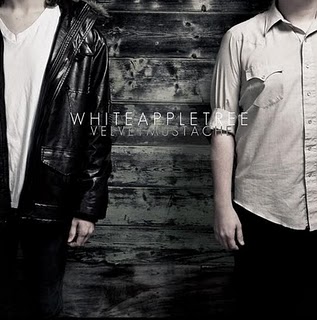

Yet from the images that I captured, the most suitable image that could be used on the front cover of the digipack was of the female character. The image shows the female standing in front an edited white background suggesting that she feels lonely and vulnerable, yet also suggesting she stands out like an angel. With the use of Photoshop the image was adapted into something more appealing to the audience, and the name of the artist and song title was added in black font to help stand out from the white background.

The inside panels of a digipack are images that intrigue the audience, yet their main purpose of being there is to make the CD stand out and for decoration. I used my own creativity and inspiration to design both images, taking them from my music video and using Photoshop to edit the pair. The left panel (second out of the four) will be the image that the audience will see more, with the other panel having the CD cover it. The names of the band members were installed onto this image, giving them more familiarity with their audience. The text is in white font, helping to make it stand out and grab the attention of the audience’s eye. The colour of the background is dark clashing with the white of the snow to add a scene of drama. The use of black in the image with the ghost like editing of the characters symbolizes the temporary nature at young love.

The right panel of the inside of the digipack (the third panel out of the four) is the panel where the CD will be situated. This image is of the male character playing the guitar while the sun shines down onto him. The image is super imposed with the eyes of the female character, suggesting that she is his muse. This panel contrasts to the mood of the left panel, with bright colours used instead of the dark colours in the other panel to add contrast.

The back cover of a digipack is where most of the institutional details are held, including song titles, the record label, and the band’s website. The image that I used for the back cover was of both characters leaning up against opposite sides of a tree.

I used Photoshop to change the colours of the image, making the left side of the image (the side of the female character) black and white, while increasing the contrast and brightness of the right side of the image (the side of the male character). This idea was used to highlight the contrast between the male and female characters. I input the informative text in the middle of the image, situated on the tree, as the image follows the rule of thirds so the audience’s eye is attracted to the information about the album.

With the text on the back cover important to inform the audience I researched different fonts to find out each one appealed to the audience the most. Using the website ‘dafont.com’ to look at different types of font I was able to narrow it down to a shortlist of two. The two fonts were; Hand of Sean and Verdana. After trying both and seeing which best fit the image, I chose Hand of Sean.

In the 21st century the way that new albums and artist are marketed have completely changed and developed thanks to technology, thus making the research for my advertisement poster difficult. Only a few artists use magazine adverts nowadays, so I decided use ideas from all genres. I was inspired on how to design my poster from the help of two posters; one advertising Italian heavy metal band Arthemis, and the other being the English RnB group N-Dubz.


I took the designs that both had used and developed them together. I used the inclusion of the front cover of the digipack on the poster from Arthemis, along with the use of persuasive text, such as “the world’s greatest songwriters”, to help the sell the album. I then merged this with the use of an image as a background instead of just a plain colour, inspired from the N-Dubz poster, challenging the convention for most unsigned indie bands that use a white background or an image of the band members themselves.
 With the help of Photoshop, I decided to use an image of the feet of both characters from the music video with a picture of the front cover of the digipack in between their legs, using the rule of thirds again to make the audience attracted to look at the album.

The input of positive text of the album was essential for the poster to help encourage the audience to buy it; this being used at the bottom of the poster underneath the character’s feet. Website information is included so potential fans can find out more about relend.

I also had to research the font that I used for the name of the artist and album, using the same website as before ‘dafont.com’. After looking through the fonts that I believed would suit the genre, I decided to use the ‘Green Pillow’ font, with it having a conventional indie pop look.


 Third Panel
 Design 2
 Design 3


 This is the font that I chose to used, along with the name of the record company I came up with. After looking through fonts I decided that this one fitted best with the image of the star, with nearly the exact same design used for both. The font also has a funky look to it, making it much more interesting to read than just a plain 'Times New Roman' font.
 This is the finished design that I made for the record company logo.